|

|
n a time when all you hear or read about is mobile first, it took the aviation industry a bit
longer to get on board. While there are still some non-mobile-friendly sites that exist, that’s
changing. |
Today more than half of all website traffic views content on a mobile device. Providing website
accessibility for all screens lets you reach the largest audience possible.
If you’ve decided it’s high time to make your site mobile friendly, have a clear direction of what you
want the site to do and what messages you want to convey. Keeping your company’s look and
feel consistent through all channels builds your brand and fosters greater engagement. Consider
the following when creating or redesigning your site for a better user experience
(UX).
Navigation
Hamburgers, circles or labels? Dropdown, slideout or footer nav? With so many options available,
deciding what navigation technique to use can be a little daunting.
| The default button has become the hamburger. You know, the nondescript icon in the upper right
corner what has three lines stacked on top of each other. But, is it the right solution? Testing each
option is the only way to know for sure. We’ve found most people interact with the word “menu”
more than the hamburger icon. Even adding a box around the word increases its use.
The way users interact with the navigation is critical. The list of links can drop from the top of the
page, slide out from the right or left or push you down to an anchored list. Our agency has used all
three. We’ve abandoned the anchored list and suggest you do, too. Being pushed to the bottom of
the page disorients users and makes it difficult for them to know where they are. The slide out
navigation works well and looks good, but on older phones, you can run into page scrolling issues,
since there are a lot of moving parts.
The dropdown navigation is easy to use, lightweight and
familiar to users. Be sure to provide ample thumb space between links to avoid the frustration of
bad clicks. |
 |
|
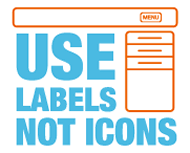 |
What’s not to love about the pretty illustrations representing areas on your site? Turns out, plenty.
Sure, they’re fun, but are they effective for navigation? Not really. They end up confusing the user
rather than being helpful. If you must use an icon, label it. So why not just use the label? Earlier I
discussed the hamburger as a navigation icon, when the word “menu” works much better. Don’t
get fancy with your page names; keep them simple and easy to understand. Users aren’t going to
stick around if they can’t find what they want quickly. |
|
| This doesn’t mean make headlines as large as possible and you’re good to go. Large headlines
can be harder to read and create bad line breaks. With the improvement of current screen
resolutions, smaller type is crisper and easily read. Type still needs to be larger, but not as much
as you think. Experiment with type sizes, line spacing and line lengths. A good base size for body
copy is 16 pixels. Anything under that is too small. Headlines |
 |
| need to be noticeably larger to
provide contrast; 24 pixels is a good size to start with. Longer
line lengths require more line space, whereas shorter ones need to be tighter. |
Do not exclude
Include everything on mobile that’s on your desktop site. If there’s too much content for mobile,
then it’s safe to assume you have too much content overall. Paring down the information you
provide is a good thing. This piques interest and gives users a reason to take an action. Whether
it’s requesting more information through a contact form or subscribing to a newsletter. Give them
more information upon request.
Calm down on the scrolling
Everyone is used to scrolling on a mobile device, but let’s not make it a marathon for your thumb.
Scrolling down the page is the easy part, scrolling back up to revisit a point of interest is a pain.
Sure, “back to top” links work, but they only do that one thing: shoot you back to the very top of
the page. And infinite scroll is terrible on mobile, since there’s no indication where you are on the
page or if there’s an end in sight. It delivers a bad user experience.
 |
Before you launch your final product, test it on as many devices as possible. New phones, old
phones, tablets, all operating systems and within all browsers. Check load time, how it renders,
how the images are cropped, type size and page length. Have a variety of people from different
locations test. Remain patient and diligent when testing. While there’s no foolproof method to
catch every possible issue, eliminate as many glitches as possible before taking the site live. |
One recent study reveals that since the year 2000, the average attention span has dropped from
12 to 8 seconds. That doesn’t give you much time to make your case, to build a relationship or to
evoke a desired action. Offering the best possible user experience helps.
Good luck.
| ©BlueSky
Business Aviation News | 15th September 2016 | Issue #383 |
| . |
 |
| BlueSky
- your weekly business and executive aviation news - every
Thursday |
| . |
 |
|
